Monday, March 15, 2021

Bubble chart in Excel

 Bubble chart in Excel:

        Bubble chart show the relationships between sets of values.

        Bubble chart compare at least three sets of values or pairs of data.

        You can use it when you have a third value that can be used to determine the relative size of the bubble.

Process of creating a bubble chart in Excel:

  • Select your data range B3:D6 to create bubble chart. 


  • Go to insert tab ➤ charts group ➤ select insert scatter or bubble chart ➤ select 3D Bubble chart.


  • Now 3D Bubble chart immediately appears on your excel sheet.


  • Click on chart title to edit it.
  • Click on any bubble on your chart ➤ right click on a bubble➤ click on format data series.
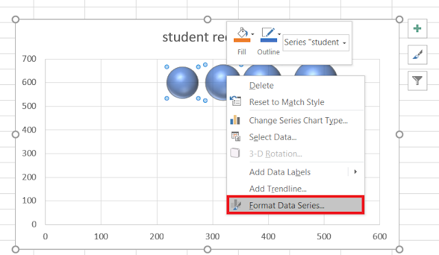
  • A format data series panel appears ➤click on the paint bucket tool ➤ select vary colors by point.


  • Now your chart looks like the below.


  • Here you can change the chart style from design tab
  • Go to design tab select any chat style from chart style group.


Result:


  • To add data labels click on the + icon on the right side of chart ➤click on data label ➤go to more option.


  • Now Format data labels panel appear.
  • Here you can select bubble size, show leader lines which you want to add in your chart.
  • Also you can add label position center, left, right, above or below of your bubble.


  • Now the result shows like the below.....


  • To add legend click on + icon on the right side of your chart ➤ click on legend.


  • Result appears showing legend like this....


  • To change the shape of data labels right click on the data label of your chart ➤ change data label shapes➤ select any shape


  • Now data labels appears with your selected shape. Slightly move them to fix to correct position.


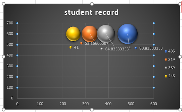


In this process you can create a bubble chart in excel.

Monday, March 8, 2021

Scatter chart in Excel

Scatter chart

        Scatter chart is used to show the relationship between sets of values.

  • Select the range of data B2:C18


  • Go to insert tab click on scatter chart.
  • Select scatter.


  • Now your scatter chart appears immediately.


  • Here you can add a trendline to see the relationship between the two variables(square meter and prices of  apartment)
  • Click on the + icon on the right side of your chart➤ click on trendline option➤ select linear.
  • Now your trendline appears like this.

How to create scatter with straight line:

        Use this chart type to compare at least two sets of values or pairs of data. 

        When there are many data points you can use scatter with straight lines. The data represents separate measurements.

  • To create a scatter with straight lines chart select your data range  A1:B10.


  • Go to insert tab➤ charts group➤ click on scatter chart➤ select scatter with straight line.


  • Now your scatter chart with straight line appears. (here I added a chart style from design tab to see the chart clearly)


  • You can add chart title here.
  • Double click on the chart title and rename  the chart title.
  • To add data labels to your chart click on the + icon on the right side of your chart ➤ click on data label ➤ select where you want your data labels in your chart( center / left/ right/above/below)


  • Now your chart looks like this👇


In this process we can create a scatter chart in excel.

Bubble chart in Excel

  Bubble chart in Excel:           Bubble chart show the relationships between sets of values.          Bubble chart compare at least three ...